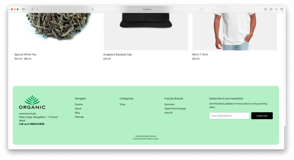
Finally, a new footer SCSS is born, setting a new standard for me and my themes. Clean, minimal, and built to last into the future. #Bookmark #bigcommerce #marketplace
Everest Organic Bigcommerce Theme
footer.footer {
	background-color: $body-bg;
	padding: 2rem;
	border: none;

	.container {
		background: stencilColor("footer-backgroundColor");
		border-radius: 20px;
		padding: 2rem;
		max-width: 100%;
	}

	.footer-info-col {
		margin-top: 0px;

		.footer--address {
			margin-bottom: 2rem;

			address {
				font-style: normal;
			}
		}

		.footer-info-heading {
			padding: 10px 0px;
			margin: 0px;
			border-top: container("border");
			font-size: fontSize("smaller");

			@include breakpoint("medium") {
				border: none;
			}
		}

		.footer-info-list {
			display: none;
			margin-bottom: 1rem;

			@include breakpoint("medium") {
				display: block;
			}

			li {
				padding: 5px 0px 5px;
				text-transform: capitalize;

				@include breakpoint("medium") {
					padding: 5px 0px 0px;
				}
			}
		}

		.footer-info-list.active {
			display: block;
		}

		a {
			span {
				position: relative;

				&::after {
					content: '';
					position: absolute;
					width: 100%;
					transform: scaleX(0);
					height: 1px;
					bottom: 0;
					left: 0;
					background-color: stencilColor("navUser-color-hover");
					transform-origin: bottom right;
					transition: transform 0.25s ease-out;
				}

				&:hover::after {
					transform: scaleX(1);
					transform-origin: bottom left;
				}
			}
		}

		@include breakpoint("small") {
			width: 100%;
			text-align: center;
		}

		@include breakpoint("medium") {
			width: 16%;
			text-align: left;
		}

		@include breakpoint("large") {
			width: 20%;

		}
	}

	@include breakpoint("medium") {
		.footer-info {
			display: flex;
			margin: 2rem 0px;
		}

		.footer-info-col[data-section-type="storeInfo"] {
			width: 25%;

			.footer--logo .header-logo {
				margin: 0px 0px 1rem;
				text-align: left;

			}
		}

		.footer-info-col[data-section-type="newsletterSubscription"] {
			width: 35%;
		}
	}

	@include breakpoint("large") {

		.footer-info-col[data-section-type="newsletterSubscription"] {
			width: 30%;
		}
	}

	.footer-copyright {
		text-align: center;
	}
}Expand