Categories
blog scss

🌈 Happy Grid — Happy Me


 #product-listing-container,#tab-related {
	 display: flex;
	 flex-wrap: wrap;
	 padding: 0;
	 margin: 0;
	 list-style: none;
	 align-items: stretch;
	 justify-content: flex-start;
	 width: 100%;
}
 ul.productGrid, ul.product-list {
	 width: 100%;
	 display: flex;
	 flex-wrap: wrap;
	 li {
		 flex: 0 0 50%;
		 display: flex;
		 padding: 0px !important;
		 @include breakpoint("medium") {
			 flex: 0 0 25%; 
		}
		 .card {
			 display: flex;
			 flex-direction: column;
			 flex: 1;
			 box-sizing: border-box;
			 height: 100%;
			 margin-bottom: 1rem;
			 .call-button {
				 margin-top: auto;
				 .button {
					 background: stencilColor('button--primary-backgroundColor');
					 color: stencilColor('button--primary-color');
					 
					 &:hover {
						 
						 background: stencilColor('button--primary-backgroundColorHover');
						  color: stencilColor('button--primary-colorHover');
						  
						  span {
							   &::after {
									content: '';
									position: absolute;
									width: 100%;
									transform: scaleX(0);
									height: 1px;
									bottom: 0;
									left: 0;
									background-color:  stencilColor('button--primary-colorHover');
									transform-origin: bottom right;
									transition: transform 0.25s ease-out;
									transform: scaleX(1);
									 transform-origin: bottom left;
								} 
								 
						   }
					 }
					 
					 
				}
			}
		}
	}
}

Categories
blog css scss

cheat.css

 font-family: fontFamily("headingSans"); 
 
 font-weight: fontWeight("bold");
 
 
 font-size: fontSize("largest");
 
 container("border");
 
  
 filter: blur(20px);
 -webkit-transition: all 2s ease;
 transition: all 2s ease;
 
 
 backdrop-filter: blur(10px);
 
 background: rgba( $header-bg,0.8); 
 
 
 @include breakpoint("medium") 
 
 
 $screen-small: 801px;
 $screen-medium: 1261px;
 $screen-large: 1600px;


 stencilColor('button--primary-backgroundColor');
 stencilColor('button--primary-color');


 display: flex;
 justify-content: center;
 align-items: center;
 
 
 overflow: auto;
 white-space: nowrap;
 
 
 &::after {
     content: '';
     position: absolute;
     width: 100%;
     transform: scaleX(0);
     height: 1px;
     bottom: 0;
     left: 0;
     background-color: stencilColor("navUser-color-hover");
     transform-origin: bottom right;
     transition: transform 0.25s ease-out;
 }
 
 &:hover::after {
     transform: scaleX(1);
     transform-origin: bottom left;
 }


    overflow: auto;                 
    scrollbar-width: none;        
    -ms-overflow-style: none;     
 
    &::-webkit-scrollbar {
        display: none;                  
    }


    #product-listing-container,#tab-related {
	 display: flex;
	 flex-wrap: wrap;
	 padding: 0;
	 margin: 0;
	 list-style: none;
	 align-items: stretch;
	 justify-content: flex-start;
	 width: 100%;
}
 ul.productGrid, ul.product-list {
	 width: 100%;
	 display: flex;
	 flex-wrap: wrap;
	 li {
		 flex: 0 0 50%;
		 display: flex;
		 padding: 0px !important;
		 @include breakpoint("medium") {
			 flex: 0 0 25%; 
		}
		 .card {
			 display: flex;
			 flex-direction: column;
			 flex: 1;
			 box-sizing: border-box;
			 height: 100%;
			 margin-bottom: 1rem;
			 .call-button {
				 margin-top: auto;
				 .button {
					 background: stencilColor('button--primary-backgroundColor');
					 color: stencilColor('button--primary-color');
				}
			}
		}
	}
}


Categories
bigcommerce scss

The Cleanest Footer SCSS Ever (No Joke)

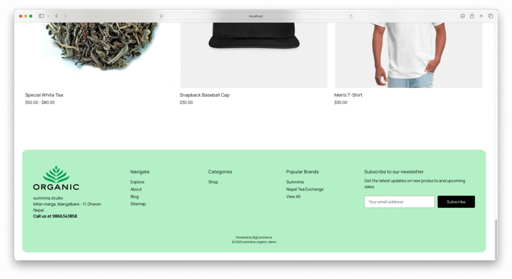
Finally, a new footer SCSS is born, setting a new standard for me and my themes. Clean, minimal, and built to last into the future. #Bookmark #bigcommerce #marketplace

Everest Organic Bigcommerce Theme

footer.footer {
	background-color: $body-bg;
	padding: 2rem;
	border: none;

	.container {
		background: stencilColor("footer-backgroundColor");
		border-radius: 20px;
		padding: 2rem;
		max-width: 100%;
	}

	.footer-info-col {
		margin-top: 0px;

		.footer--address {
			margin-bottom: 2rem;

			address {
				font-style: normal;
			}
		}

		.footer-info-heading {
			padding: 10px 0px;
			margin: 0px;
			border-top: container("border");
			font-size: fontSize("smaller");

			@include breakpoint("medium") {
				border: none;
			}
		}

		.footer-info-list {
			display: none;
			margin-bottom: 1rem;

			@include breakpoint("medium") {
				display: block;
			}

			li {
				padding: 5px 0px 5px;
				text-transform: capitalize;

				@include breakpoint("medium") {
					padding: 5px 0px 0px;
				}
			}
		}

		.footer-info-list.active {
			display: block;
		}

		a {
			span {
				position: relative;

				&::after {
					content: '';
					position: absolute;
					width: 100%;
					transform: scaleX(0);
					height: 1px;
					bottom: 0;
					left: 0;
					background-color: stencilColor("navUser-color-hover");
					transform-origin: bottom right;
					transition: transform 0.25s ease-out;
				}

				&:hover::after {
					transform: scaleX(1);
					transform-origin: bottom left;
				}
			}
		}

		@include breakpoint("small") {
			width: 100%;
			text-align: center;
		}

		@include breakpoint("medium") {
			width: 16%;
			text-align: left;
		}

		@include breakpoint("large") {
			width: 20%;

		}
	}

	@include breakpoint("medium") {
		.footer-info {
			display: flex;
			margin: 2rem 0px;
		}

		.footer-info-col[data-section-type="storeInfo"] {
			width: 25%;

			.footer--logo .header-logo {
				margin: 0px 0px 1rem;
				text-align: left;

			}
		}

		.footer-info-col[data-section-type="newsletterSubscription"] {
			width: 35%;
		}
	}

	@include breakpoint("large") {

		.footer-info-col[data-section-type="newsletterSubscription"] {
			width: 30%;
		}
	}

	.footer-copyright {
		text-align: center;
	}
}
Expand